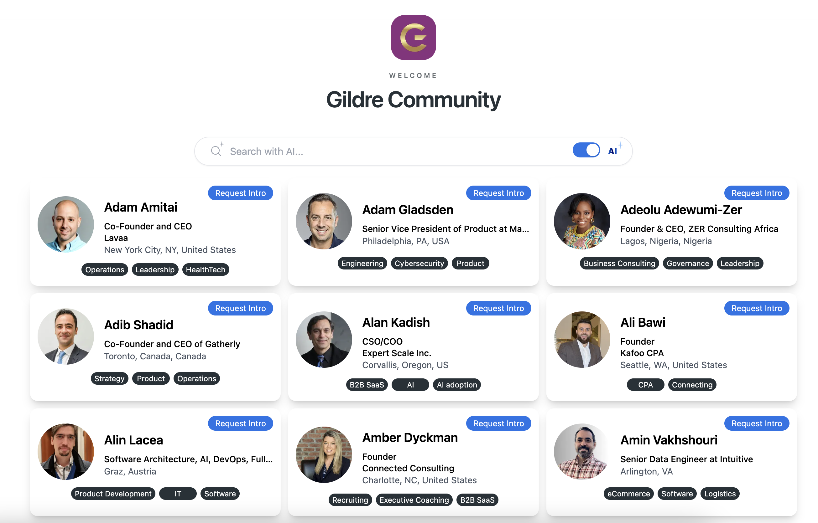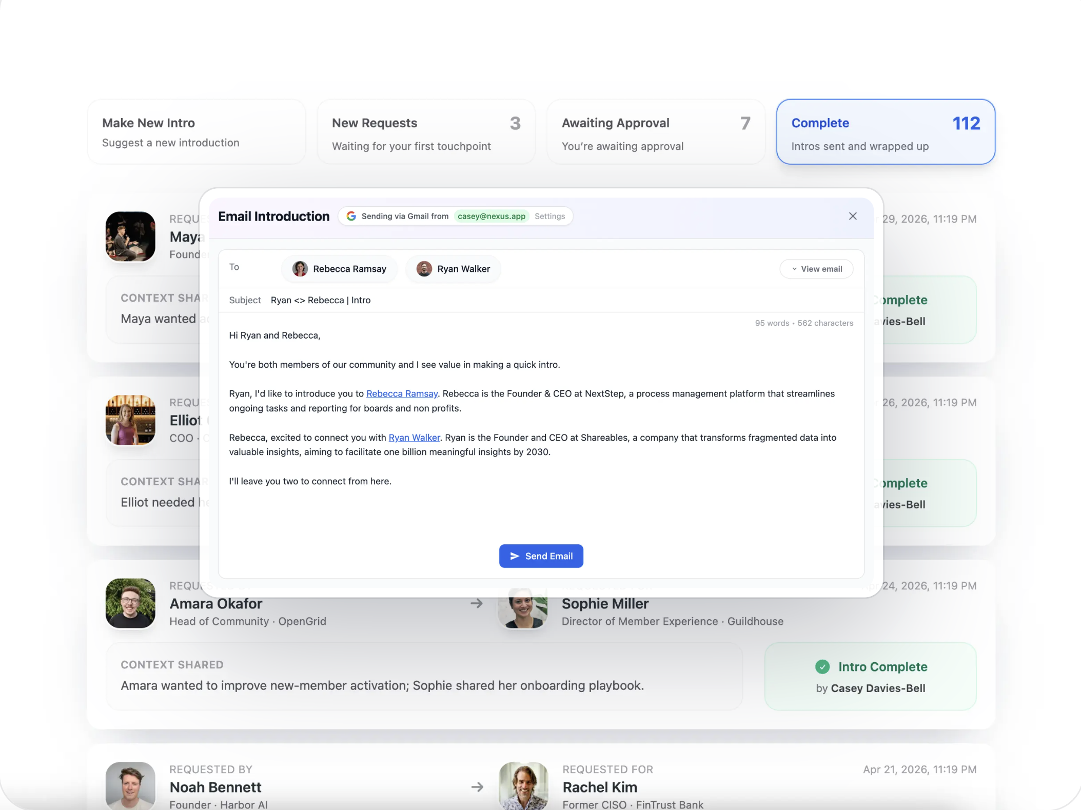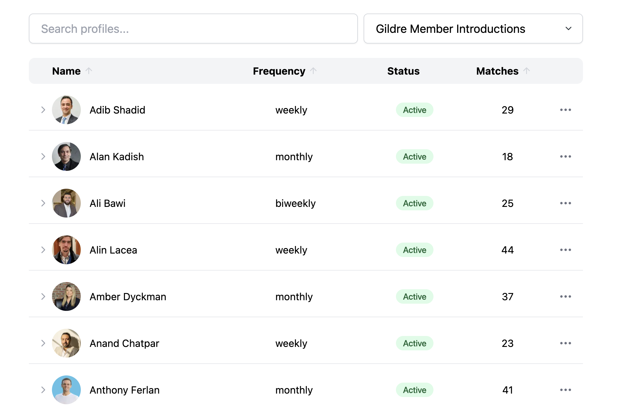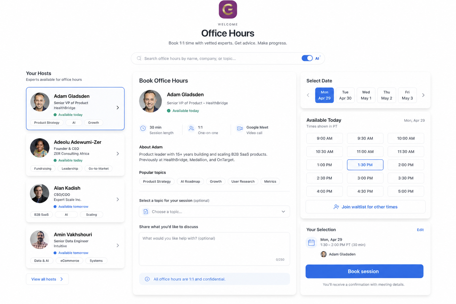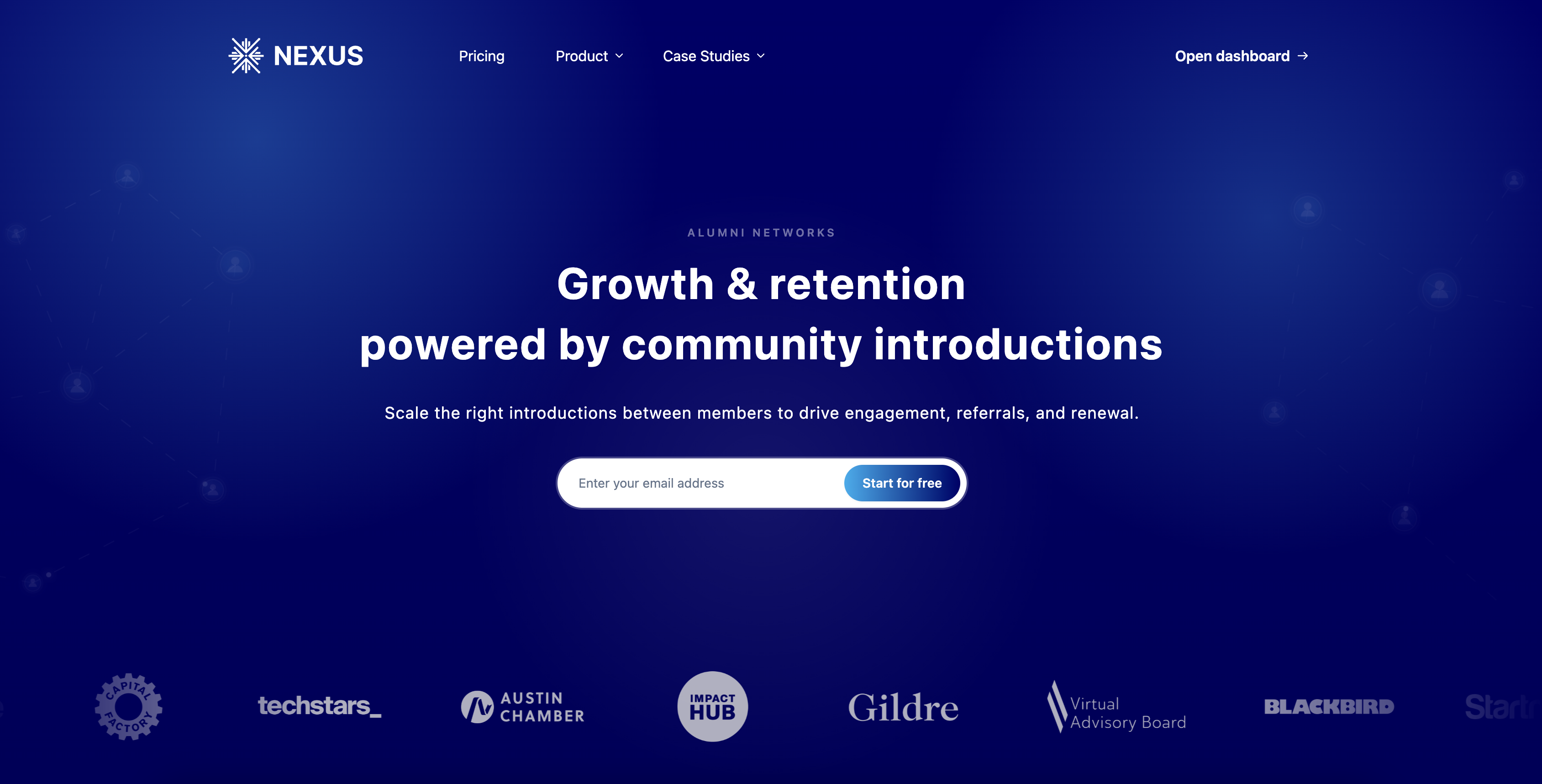
Homepage refresh
About a week ago, the site was a slimmer landing page: it got the message across, but didn’t leave much room to show what Nexus is like in practice. Today it’s closer to a guided tour—more narrative, more context for how teams use it, and a calmer read from top to bottom. Same product; a fuller first impression for someone who’s never logged in.
Improvements
- The story of what Nexus does—and who it’s for—has room to breathe instead of living in one hero block.
- The page feels easier to scan and stick with; less “splash screen,” more “here’s what you’re signing up for.”
- The path to try it reads more clearly end to end.